Positive Futures Advisory is Roger Swinbourne’s firm: sustainability and resilience advisory from Sydney, working across Australia. We called the project Positively Brilliant.
The challenge
Roger Swinbourne’s advisory works with developers, investors, boards and government on sustainability, resilience and long-term value. The firm’s edge is seeing value others miss and making complex futures thinking usable in a boardroom. The work had moved faster than the brand. Reports, decks and the website had each been built as needed, at different times. The thinking was rich for a specialist reader and harder for a board to take in at pace. My job was to make the complex digestible. The website was parked while the firm focused on client work.
A brand brought into line with what the firm actually sells, then carried through reports, a 120-page BD presentation and a new website.
What we did
- Brand meaning first. What the firm stands for, what its USP is, and how that should show up visually. The answer was a growth-ring mark, warm natural colour, and a tone that treats complex ideas with calm.
- Tagline work. “The value others miss” for the commercial line, “Building the future we want” for the belief line.
- Design system. Fraunces and Century Gothic, a green, cream, ochre and rust palette, layout rules and a report template everything else was built from.
- Simplifying the complex. Client reports that carry the brand yet read as their own piece, with tables rebuilt as graphic stories and a clear narrative arc. Includes the Nature Risks and Opportunities paper for Mirvac and the Intelligent Cities and Regions CRC prospectus, an 11-page printed leave-behind for CEOs with a 3-page executive version.
- The firm’s 120-page BD presentation rebuilt on the system with storytelling built in, in Canva, the client’s preferred platform, so the team edits it themselves.
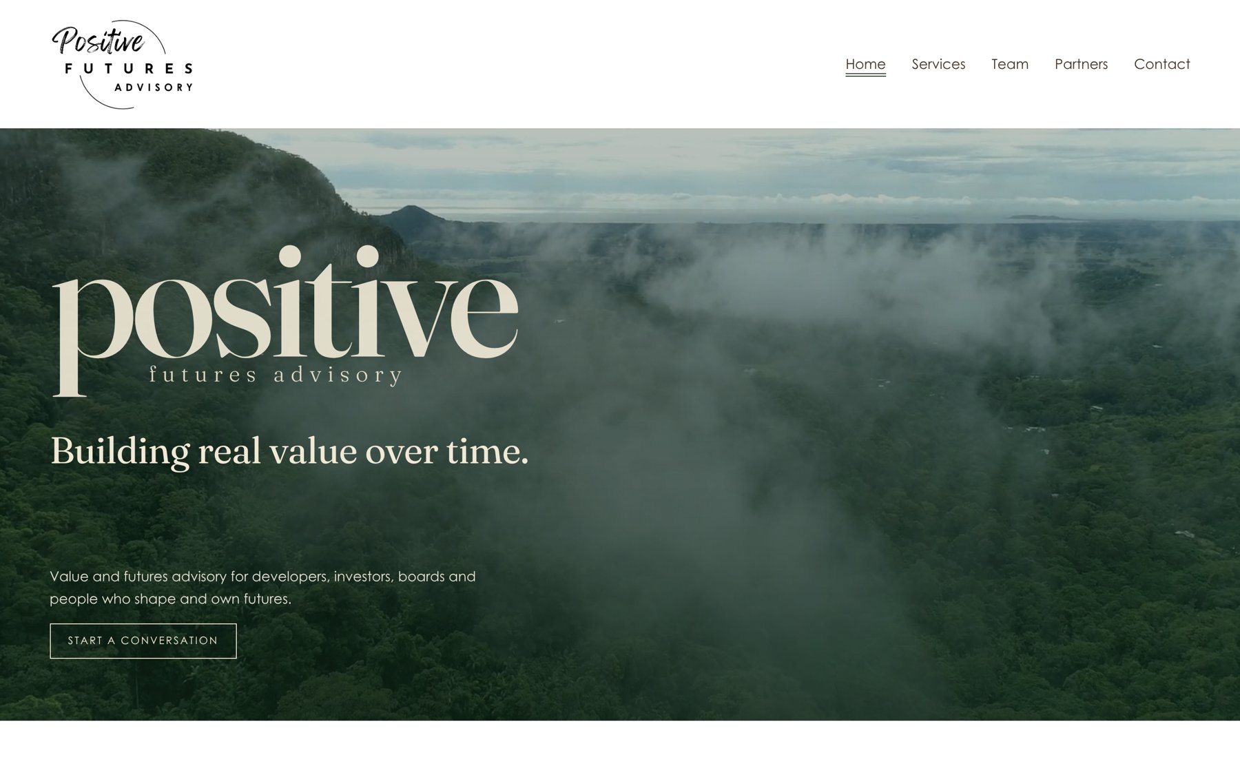
- Six-page Squarespace website. HTML mockup first, then the live build to match, custom CSS, licensed video, team portraits and a mobile pass.
- Launch support. LinkedIn post, homepage capture and scroll video.
Outcome
The brand now says what the firm is for. Every report, deck and page looks like the same firm and reads at boardroom pace. Roger briefs new work and it comes back on system.
What I’d carry to the next advisory
- Meaning before layout. Once the brand said what the firm sells, every design decision got easier.
- Build in the client’s tools. Canva was the platform the team already used, so the 120-page deck lives there and they edit it themselves.
- A report template is a brand asset. One template, then a Mirvac paper, a CRC prospectus and a BD deck all came off it looking like one firm.
Does your work read as clearly as it thinks?
Brand meaning, a design system and the documents your clients actually hold.
Get in touch